
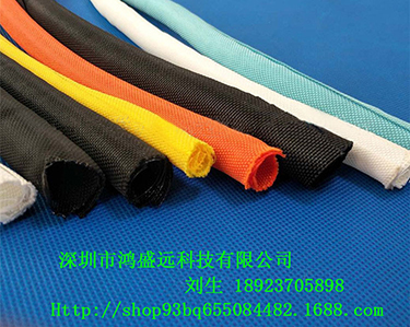
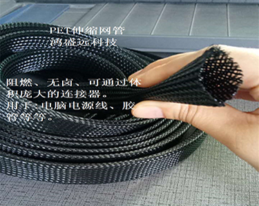
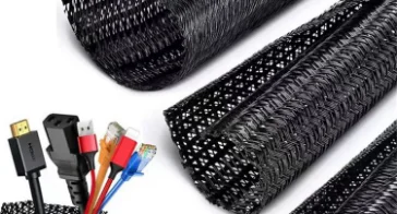
自卷式紡織套管(SCS)是用聚酯單絲和聚酯復絲紡織而成,具有耐磨性,耐酸性,防塵性,柔軟性,操作簡單,方便,快捷等特點,開口式的結構有利于保護內部線束的保養,重裝和檢修.產品廣泛應用于高鐵行業,汽車行業,電動車、折疊車、新能源汽車行業,通訊行業,自動化設備等各種線束的保護,尤其適用于不規則形狀的線束領域.
查看詳情

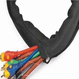
拉鏈編織網管采用聚酯單層網與拉鏈縫合而成。具有良好的散熱性、伸縮性、防火性、操作簡單方便的特點。拉鏈式的結構有利于內部線束的保護和重裝。產品廣泛應用在A/V電線、電源線、電腦電視外部鏈接線、機械設備、高鐵、工業設備、汽車等行業的線束保護。
查看詳情
拉鏈紡織套管采用聚酯復絲與拉鏈縫合而成。具有良好的防火性、降噪性、耐磨性、防塵性、防水性、防油性,操作簡單方便等特點。 拉鏈式的結構有利于產品的保護、保養和檢修。 產品廣泛應用在辦公場所、影院、工業設備、汽車、液壓油管等行業的線束保護。
查看詳情

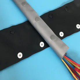
魔術貼編織套管(HSY)采用聚酯單層PET網與拉鏈縫合而成,具有良好的散熱性、伸縮性、防火性、耐磨性、操作簡單方便等特點。拉鏈式的結構有利于內部線束保養,重裝和檢修.產品廣泛應用在工業設備、機械設備、高鐵,汽車等行業的線束保護。 訂購熱線:18923707598
查看詳情

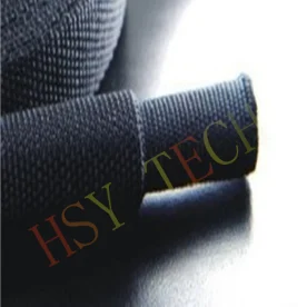
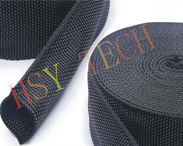
尼龍不收縮紡織套管由尼龍復絲紡織而成。具有表面光滑、抗拉力強、防爆防腐、防磨降噪、吸濕防塵等特點。尼龍不收縮紡織套管相比滌綸不收縮套管具有良好的耐磨性及柔軟性。產品主要應用于機械設備的液壓管、油管、氣管及其他管材的耐磨及防爆保護,特別適用在惡劣環境下工作的管件。
查看詳情
PVC按扣套管(PC/HPC)采用PVC材料加獨特的扣子制成,可用于電線、電纜的整理和美化,使用方便快捷。具有可重復使用、絕緣效果好、阻燃性好等特點。使用這一套管有利于多股線材的改裝或重裝,方便保養和檢修。
查看詳情

魔術貼紡織套管采用聚酯復絲與魔術貼縫合而成。具有良好的防火性、降噪性、耐磨性、防塵性、操作簡單方便快捷、可重復使用等特點。
查看詳情
熱收縮編織套管HSS由聚酯纖維和聚烯烴單絲編織而成,遇熱之后可以收縮到原來內徑的0.5倍。具有良好的降噪性、柔韌性、耐磨性及隔熱性,多用于一些異形管材。 產品應用:產品主要應用于汽車膠管、塑料管和電線不受損害,起到耐磨與降噪的作用。 訂購熱線:18566210466
查看詳情
突出的行業經驗
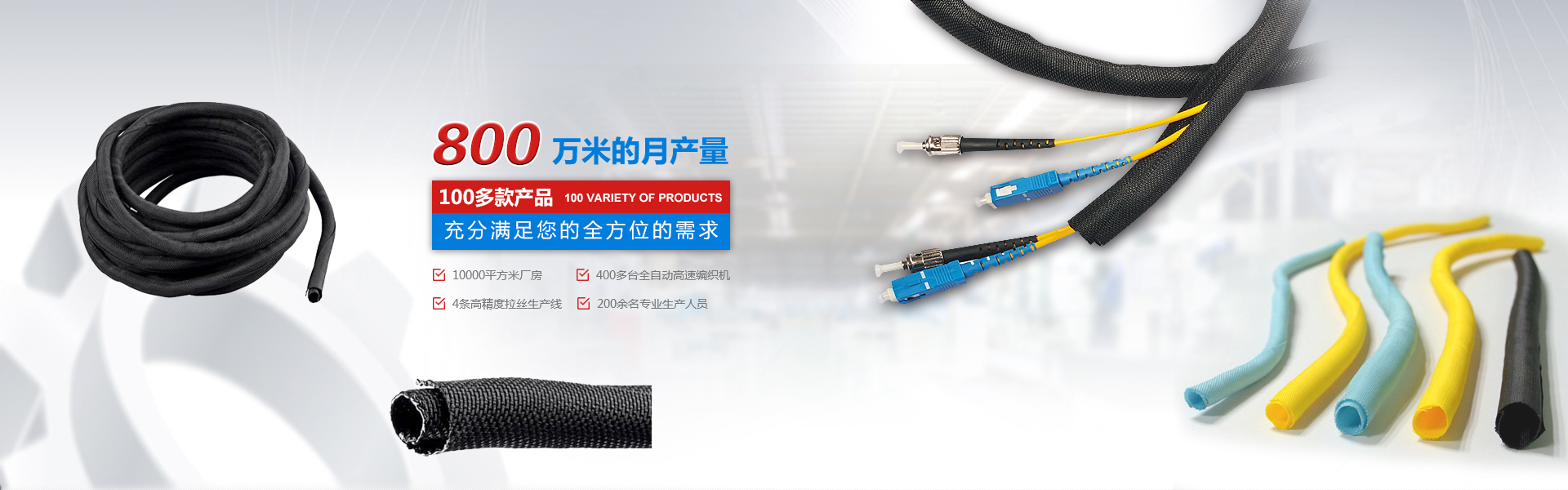
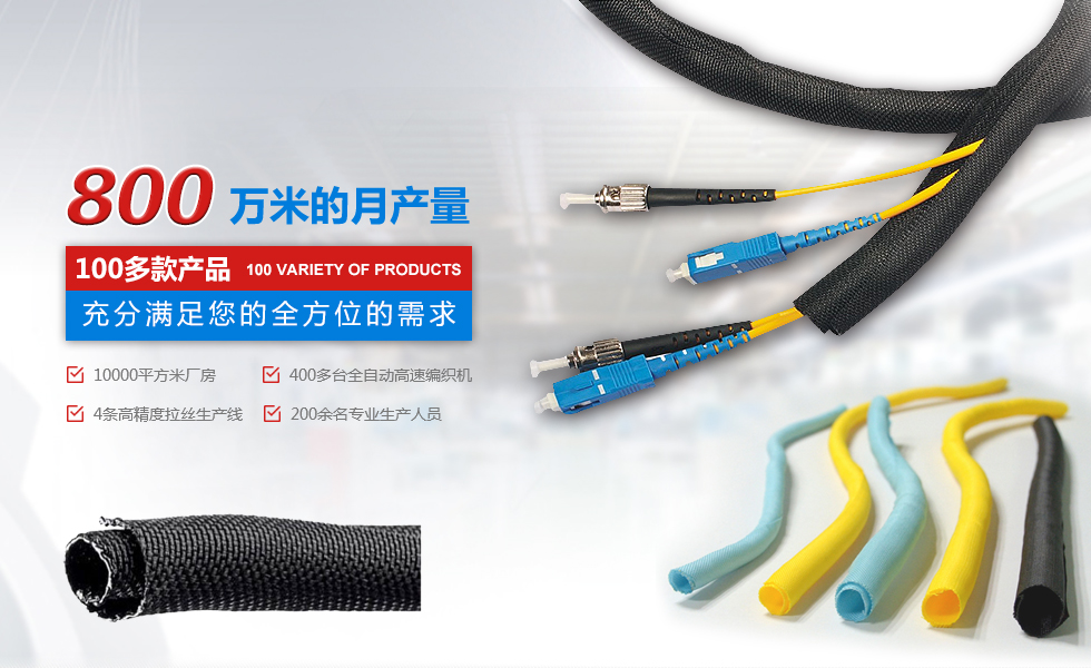
自主設計、研發、規模化大型生產企業 擁有廠房10000平米,400多臺全自動。高速編織機四條高精度紡絲生產線,員工200余人,月產量800萬米,中國最大絕緣保護套管生產企業之一。
可靠的產品質量
嚴謹專業的研發及檢驗團隊,精準先進的專業檢測設備公司通過了TS16949、ISO9001及ISO14000認證,且多項產品擁有專利,各項產品擁有ROHSREACH等國際認證及多種行業產品認證, ...
廣泛的服務范圍
樣品種類豐富,認證齊全,百款樣品免費送樣。 與FedEx,UPS,SF......等國際快遞公司合作,確保了寄樣的及時與效率。
完善的全程服務
“優良的品質+競爭的單價+快速的交期+熱情的服務+完善的管理+客戶的滿意=鴻盛遠全體人員永恒的奮斗目標”。
HSY TECH Good in Service, Better in Quality, Best in Delivery ; 鴻盛遠很好的服務,更好的質量,最好的交期。
鴻盛遠公司擁有先進的生產設備和一流的設計開發人員。公司硬件和軟件設施都過硬,解決了很多在工程實施中遇到的問題。
鴻盛遠公司不僅有一套生產設備,還有一套檢驗設備。一直用鴻盛遠的產品,不只質量過硬,而且售后服務同樣做得好。
鴻盛遠的產品質量非常好,服務也到位,發貨速度很快,我們和鴻盛遠合作的非常愉快!一直是良好的合作伙伴關系。


 聯系我們
聯系我們
